Lecture 1 Introduction & Overview

About this course

Content

Usability

Principles for Human Computer Interaction
  • Learnability
  • Efficiency
  • Safety

The Web Platform

Tech to put the principles into practice
  • HTML
  • CSS
  • Javascript
Prereqs: Basic programming and data structures (6.009)

What you won't learn in this course

Which Course?

6.S063

  • Sophomores
  • 6.009 coreq
  • Teach HTML/CSS/JS
  • Front end only
  • Weekly assignments only
  • 12 units
  • Excellent “prereq” for 6.170

6.170

  • Seniors
  • 6.031 prereq
  • Learn HTML/CSS/JS on your own
  • Full stack
  • Large final project
  • 15 units
  • "anti-req" for 6.S063

Why This Course

Instructors

David Karger

  • MIT Professor
  • PI of Haystack Group
  • Past in algorithms, networking, systems, ML
  • Research on helping people manage information (data, discussion)
  • HCI latercomer

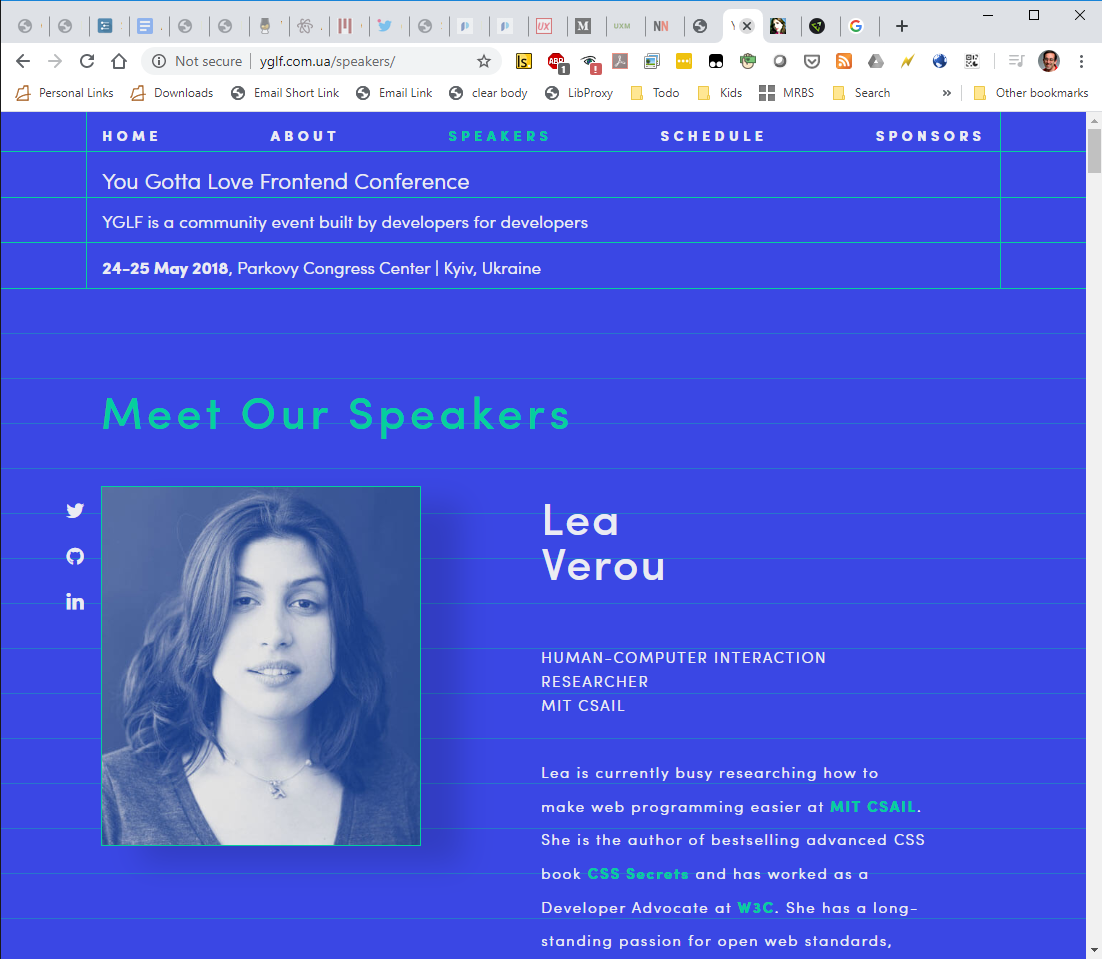
Lea Verou

  • PhD candidate in the Haystack Group
  • Research on web development
  • Invited Expert in the CSS Working Group
  • Elected member in the W3C Technical Architecture Group (TAG)

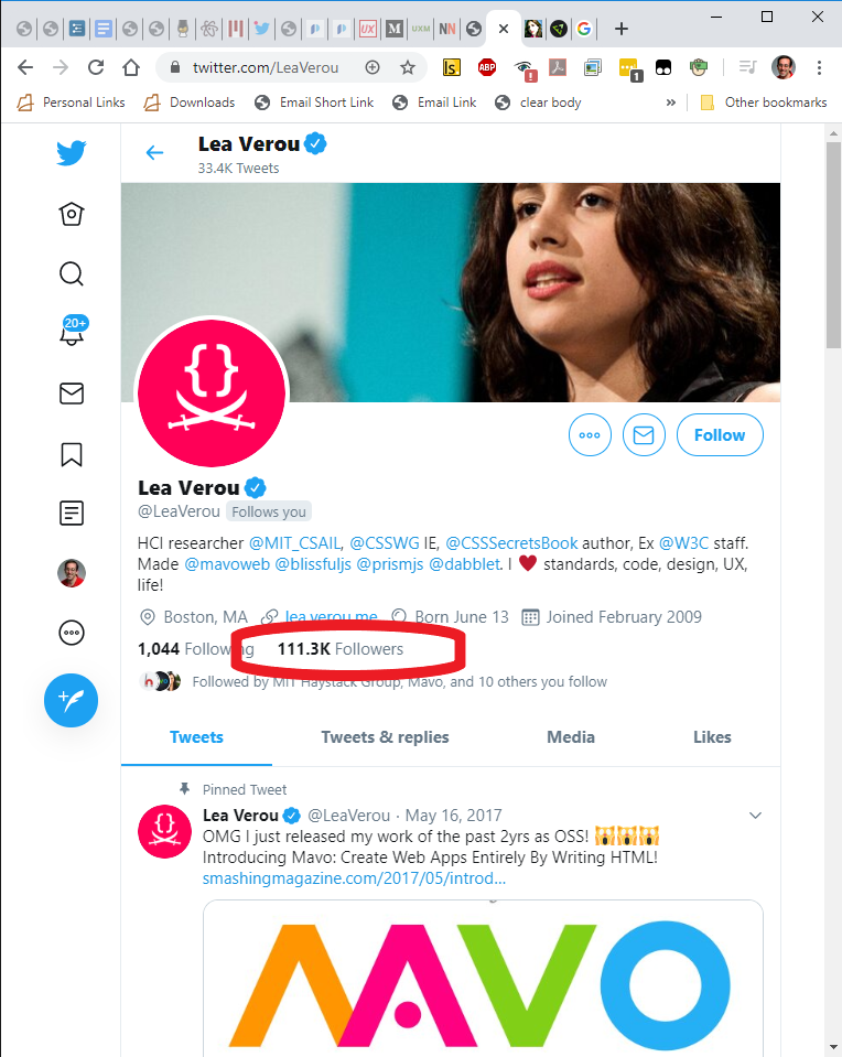
Lea Verou

Author

Speaker

Celebrity

TAs

Logistics

Format

Work

Textbook

  • Design of Everyday Things by
    Don Norman
  • Designers' bible
  • Required reading in many companies/jobs that produce tangible and software artifacts for use

Communication

This course eats its own dogfood

Assignment 1

Mandatory: signup form

  1. on course page
  2. We may need to restrict enrollment; students that haven't filled in the form are automatically left out
  3. Please fill it today or you won't be properly registered for the course
    • Won't get a lab assignment

The Big Picture

Today

Usability

Principles for Human Computer Interaction
  • Learnability
  • Efficiency
  • Safety

The web languages

Tech to put the principles into practice
  • HTML
  • CSS
  • Javascript

Usability

Usability is the ease of use of a human-made object.”

Usability is a quality attribute that assesses how easy user interfaces are to use.”

Nielsen Norman Group

"How do you expect this facuet to work?" (most people say lifting or turning the lever) Nope, the lever is just for setting temperature. The faucet is motion activated, and because the people who designed it knew it was confusing, they even added documentation to it (picture of motion sensor at the bottom right)

Software usability

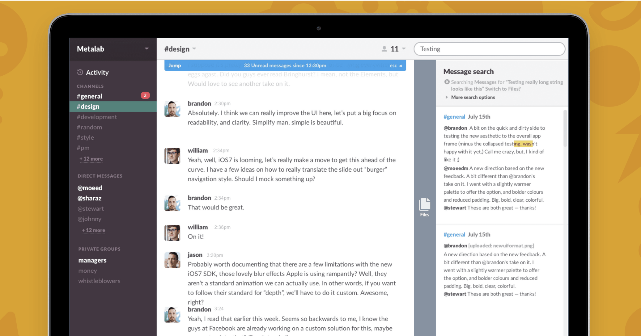
Several problems here:

  • Checkboxes that work like radio buttons (violating external consistency)
  • Meaningless grouping (violating the design principle of Proximity)
  • Lack of feedback for “Hidden”
MS Word, 2020-2022

Why Usability Matters

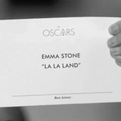
Poor usability can be 😳 embarrassing

Poor usability can be 😳 embarrassing

Best Picture (?)

Poor usability can be 💸 costly

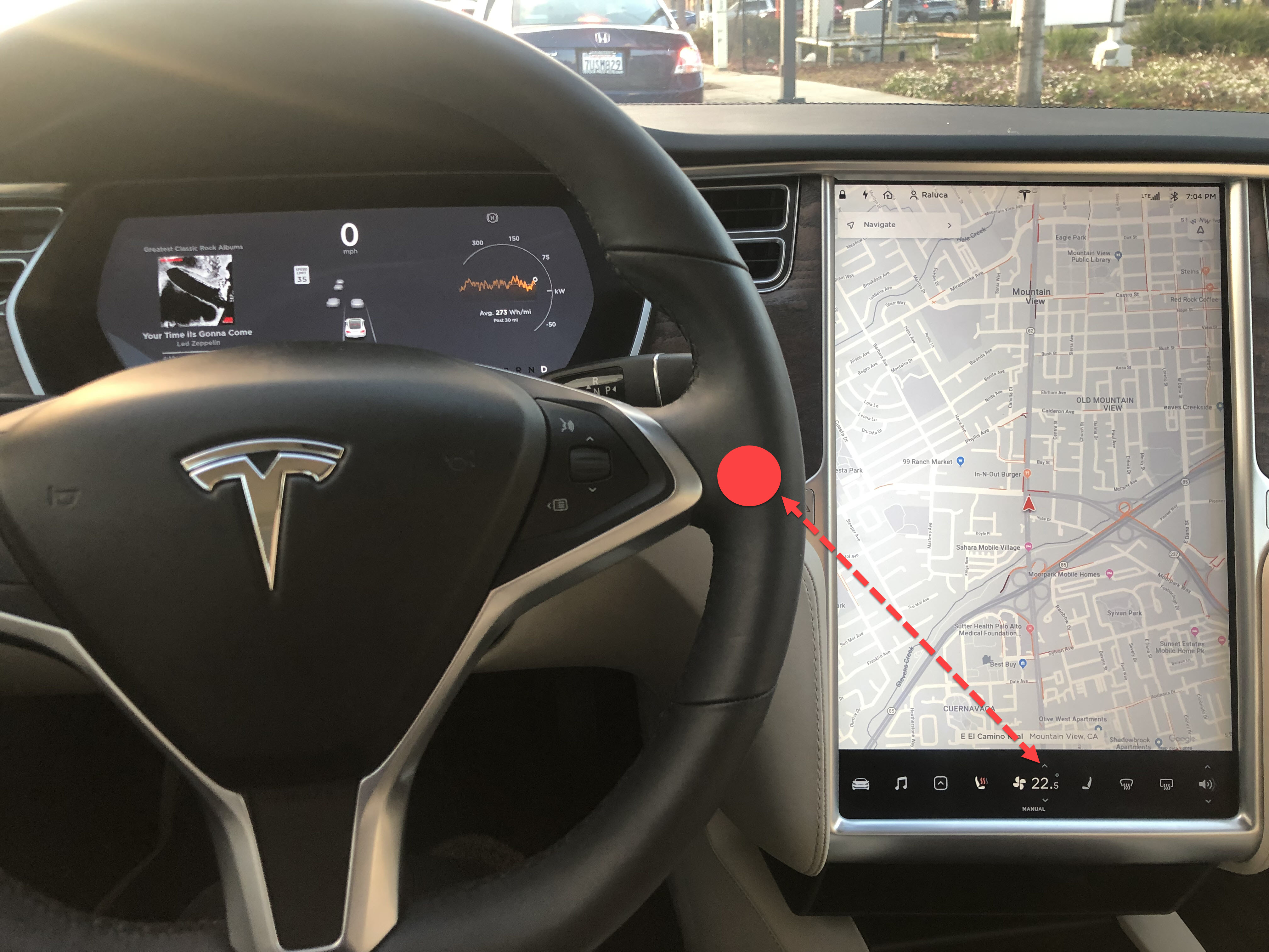
Poor usability can be 💀 deadly

Usability is often the main differentiator for 🤑 commercial success

“I have a few qualms with this app:

1. For a Linux user, you can already build such a system yourself quite trivially by getting an FTP account, mounting it locally with curlftpfs, and then using SVN or CVS on the mounted filesystem. From Windows or Mac, this FTP account could be accessed through built-in software.”

Hacker News comment on Dropbox's launch, April 5th 2007

On the Web, usability is survival.

“If a website is difficult to use, people leave. If the homepage fails to clearly state what a company offers and what users can do on the site, people leave. If users get lost on a website, they leave.If a website's information is hard to read or doesn't answer users' key questions, they leave. Note a pattern here? There's no such thing as a user reading a website manual or otherwise spending much time trying to figure out an interface. There are plenty of other websites available; leaving is the first line of defense when users encounter a difficulty.

Nielsen Norman Group

Why is UI Design hard?

Most software engineering is about communicating with other programmers

…who are a lot like you

User Interface design is about communicating with users

…who are not like you

You can’t unlearn what you know

  • Unfortunately, user interfaces are not easy to design. You (the developer) are not a typical user. You know far more about your application than any user will. You can try to imagine being your mother, or your grandma, but it doesn’t help much. It’s very hard to forget things you know.
  • Take a look at this combination lock. For those of you who are American, this is trivial to use. However, to non-US folks who are not familiar with it, it can be puzzling.
  • See also: Curse of Knowledge

The user is always right

Can’t we just ask users what they want and then do what they say?

NO!

Users are not designers

The user is not always right

“If I had asked my customers what they wanted they would have said faster horses”

Henry Ford (probably not)

It's not the customer's job to know what they want

Steve Jobs

In a study conducted in the 50s, people were asked if they’d prefer lighter telephone handsets. On average, they said they were happy with the handsets they had (which at the time were made heavy for durability).

Yet an actual test of handsets, identical except for weight, revealed that people preferred the handsets that were about half the weight that was normal at the time.

Source: Klemmer, Ergonomics, Ablex, 1989, pp 197-201

When Google surveys users about how many search results they want per page (10, 20, 30), they overwhelmingly say “30 results”.

But when Google actually deploys 30-result search pages as part of an “A/B test”, usage drops by 20% relative to the conventional 10-result page.

  • Why? Probably because the 30-result page takes a half second longer to load
  • Source: The Cost of Latency

Users make 2x errors with their own custom command line abbreviations

  • It’s easy to say, “Yeah, the interface is bad, but users can customize it however they want it.” There are two problems with this statement:
    1. most users don’t, and
    2. user customizations may be even worse!
  • One study of command abbreviations found that users made twice as many errors with their own command abbreviations than with a carefully-designed set (Grudin & Barnard, “When does an abbreviation become a word?”, CHI ‘85). So customization isn’t the silver bullet.

People are better at identifying problems they face than identifying solutions

Unpacking Usability

Dimensions of usability

Learnability

Is it easy to learn?

Efficiency

Once learned, is it fast to use?

Safety

Are errors few and recoverable?

The property we’re concerned with here, usability, is more precise than just how “good” the system is. A system can be good or bad in many ways.

If important requirements are unsatisfied by the system, that’s probably a deficiency in functionality, not in usability.

If the system is very expensive or crashes frequently, those problems certainly detract from the user’s experience, but we don’t need user testing to tell us that.

More narrowly defined, usability measures how well users can use the system’s functionality. Usability has several dimensions: learnability, efficiency, and safety.

These aren’t the only aspects of a user interface that you might care about (for example, subjective feelings are important too, as is fatigue), but these are the primary ones we’ll care about in this class.

Notice that we can quantify all these measures of usability. Just as we can say algorithm X is faster than algorithm Y on some workload, we can say that interface X is more learnable, or more efficient, or more safe than interface Y for some set of tasks and some class of users, by designing an experiment that measures the two interfaces.

Other usability dimensions are relevant
But we’ll mostly focus on LES

Aesthetics
Satisfaction, happiness, pleasure

Ergonomics
Comfort, fatigue

Usability dimensions vary in importance by user

Usability dimensions vary in importance by task

A visa application website needs learnability
Stock trading software needs efficiency
Missile launchers need safety

The usability dimensions are not uniformly important for all classes of users, or for all applications. That’s one reason why it’s important to understand your users, so that you know what you should optimize for. A web site used only once by millions of people–e.g., the national telephone do-not-call registry–has such a strong need for ease of learning, in fact zero learning, that it far outweighs other concerns. A stock trading program used on a daily basis by expert traders, for whom lost seconds translate to lost dollars, must put efficiency above all else.

But users can’t be simply classified as novices or experts, either. For some applications (like stock trading), your users may be domain experts, deeply knowledgeable about the stock market, and yet still be novices at your particular application. Even users with long experience using an application may be novices or infrequent users when it comes to some of its features.
Usability is only one attribute of a system

So how to improve usability?

Learn the Patterns

Design Critique

User testing

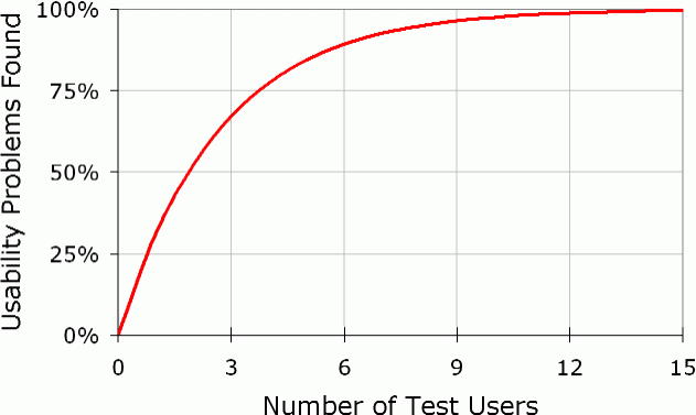
5 users are enough

The Web

What made the Web great?

It offered no new functionality!

The Web: A usability innovation

Before the Web

  1. Connect to the right FTP server
  2. Scan filenames til you find the right one
  3. Download the resource
  4. Open it (if you have the right program)
  5. (Also search with Archie)

After the Web

  1. Click the link in your browser

How the Web works

Computers connected to the Web are either

clients or servers

A web server stores or generates a web page

$ python -m SimpleHTTPServer
			Serving HTTP on 0.0.0.0 port 8000 ...
Hello world 👋

The same computer can be both

What happens when we type in a URL?

First, the client sends an HTTP request

💻

					GET /hello.html HTTP/1.1
					User-Agent: Mozilla/5.0 Firefox/71.0
					Host: haystack.csail.mit.edu
					Accept-Language: en-us
					Accept-Encoding: gzip, deflate
					Connection: Keep-Alive
				

The server replies with an HTTP response

🖥

					HTTP/1.1 200 OK
					Date: Sun, 29 Dec 2019 17:46:48 GMT
					Server: Apache/2.4.7 (Ubuntu)
					Last-Modified: Wed, 15 Nov 2017 21:16:50 GMT
					Content-Length: 6471
					Keep-Alive: timeout=5, max=100
					Connection: Keep-Alive
					Content-Type: text/html

					<!DOCTYPE html>
					<title>Hello world</title>
					<p>Hello <em>world</em> 👋
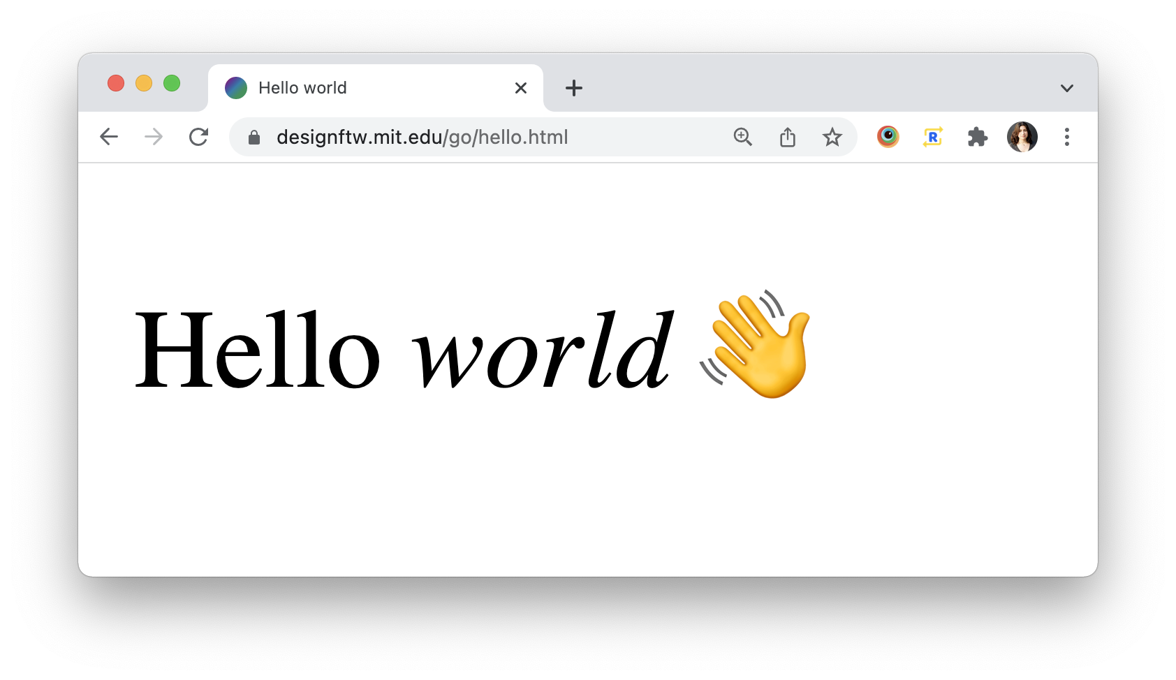
				

The browser interprets and displays the HTML

HTML

Structure

“What does it mean?”

CSS

Presentation

“How does it look?”

Javascript

Behavior

“What does it do?”

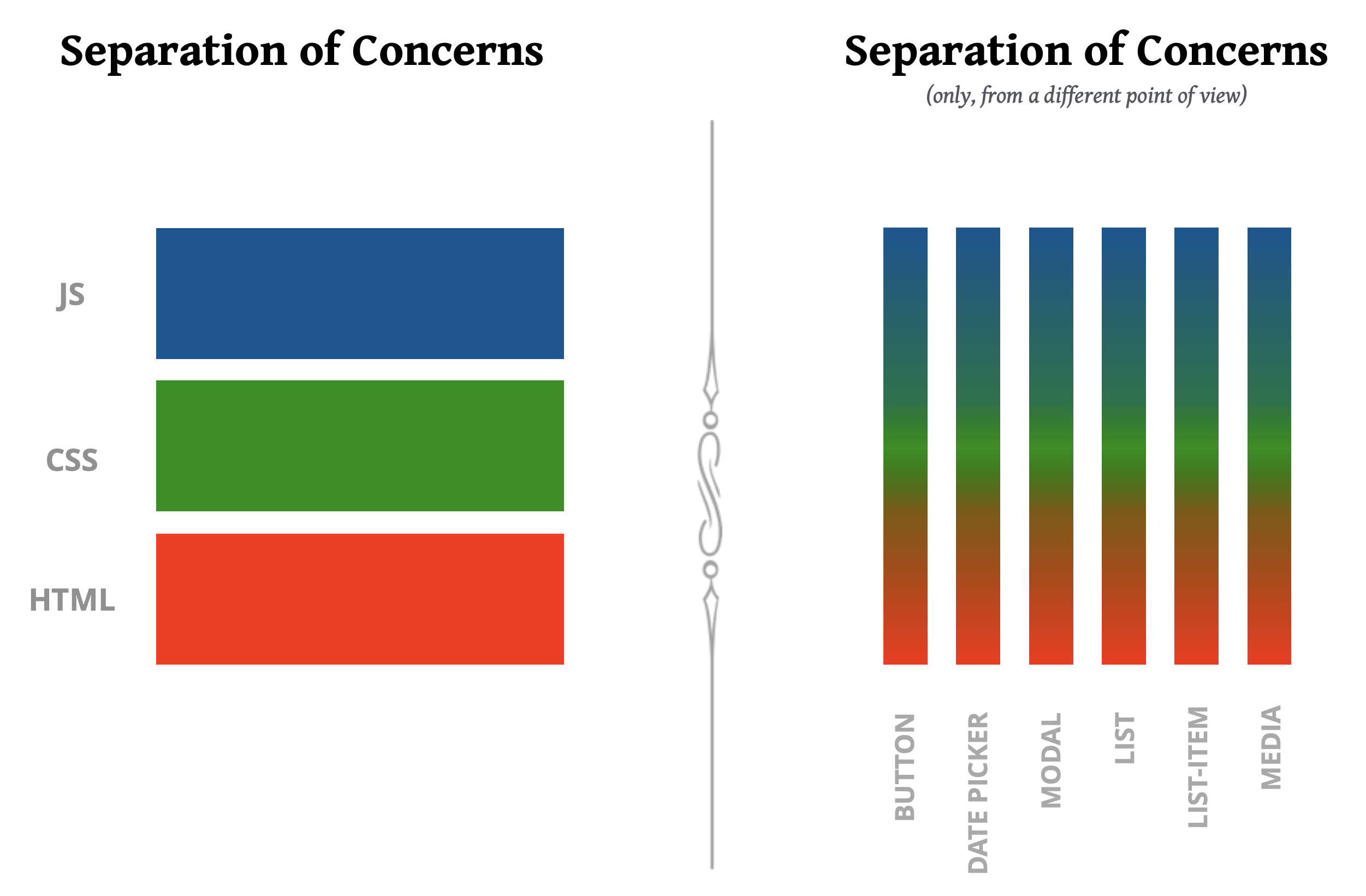
Websites are made with these three core technologies: - HTML for structure - CSS for presentation - JS for behavior Together, they are called the [Web Platform](https://en.wikipedia.org/wiki/Web_platform). which is the term used to describe the set of open technologies used to create websites and web applications. HTML, CSS, and JS are the main technologies of the Web platform, but there are others too, like [SVG](https://en.wikipedia.org/wiki/Scalable_Vector_Graphics). Sometimes the borders between them can get a bit murky (e.g. is an animation presentation or behavior?), but in general trying to keep structure in HTML, presentation in CSS, and behavior in JS leads to websites that are easier to maintain down the line. This is called [“separation of concerns”](https://en.wikipedia.org/wiki/Separation_of_concerns).
In recent years, a new architecture is emerging: instead of separating by concerns, separating by self-contained, independent, reusable components. However, [both can coexist](https://adactio.com/journal/14103): one can separate by component, and then separate concerns within each component.
So far we have discussed web technologies in the abstract. What do they actually look like? Let's start with HTML, which is used for structure.
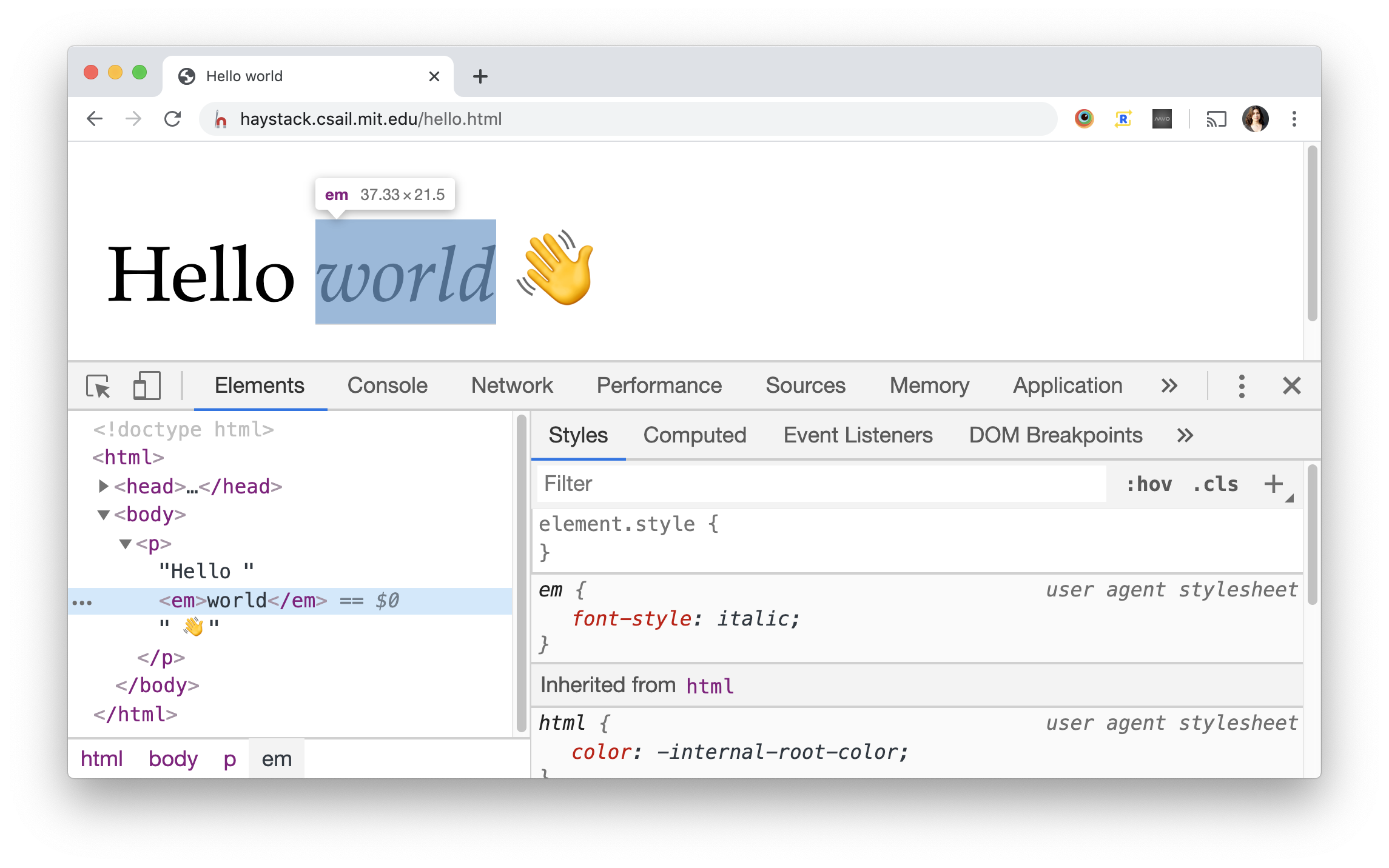
Hello <em>world</em> 👋
  • HTML consists of sequences of characters called tags, which are inserted into the content to give it structure.
  • This is why it’s called a markup language, because it largely annotates existing content.
  • This is then parsed, so it can be displayed.
Hello <em>world</em> 👋
  • Unlike RTF or other document formats, HTML tags do not turn commands on and off.
  • Instead, they form a nested structure of elements called the DOM tree.
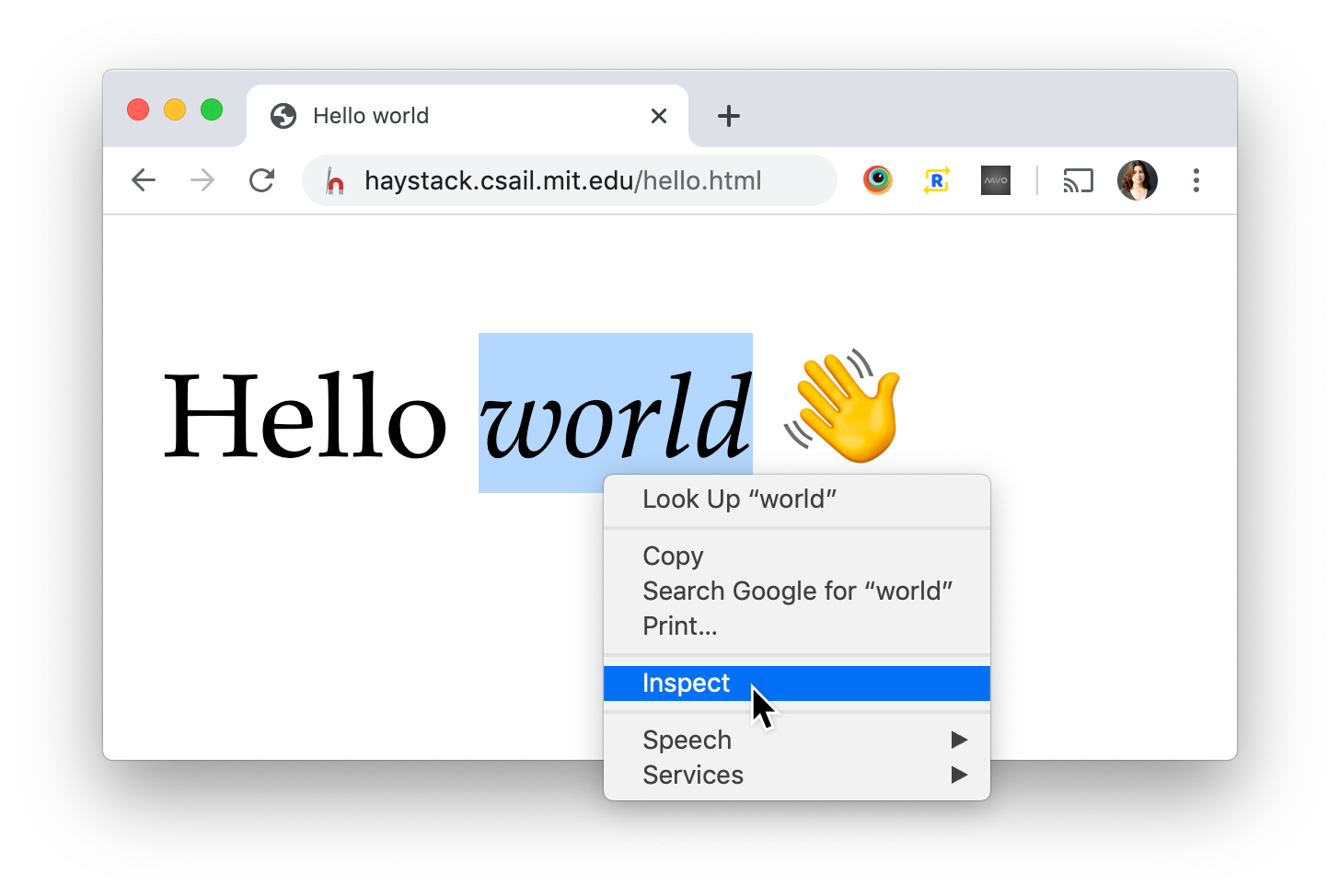
  • The browser offers us Developer Tools that allow us to peek under the hood and inspect the current state of the page and even modify it!
  • Even if we don’t add html, head, and body elements, the browser will do it for us.
  • Note that some CSS is applied anyway, from the browser. This is called User Agent CSS and has a lower priority than any CSS we write.

Minimal HTML page

<!DOCTYPE html> <html lang="en"> <head> <meta charset="UTF-8"> <title>Hello world</title> </head> <body> <p>Hello <em>world</em> 👋</p> </body> </html>
  • So what is a minimal HTML page so that people can read our markup without being intricately familiar with how HTML parsing works?
  • The lang (language) attribute is not strictly required, but is a good practice as a lot of other Web Platform features use it (e.g. CSS hyphenation)

Server-side code

PHP file on server


						...
						<body>
							<p>Hello <em>world</em> 👋</p>
							<footer>©<?= date("Y"); ?><footer>
						</body>
						</html>
					

HTML sent to client


						...
						<body>
							<p>Hello <em>world</em> 👋</p>
							<footer>©2020<footer>
						</body>
						</html>
					
  • Sometimes responding with HTML is not as simple as finding the HTML file and reading it.
  • Sometimes the server needs to execute code first, which produces the HTML markup, often after drawing data from a database.
  • Common languages for this are PHP, Node.js (server-side Javascript), Ruby, and many others.
  • In this class we will not do any server-side coding.
  • Server-side coding used to be the main way to have dynamic websites. Today, the JAM stack is becoming very popular, with static sites that use JavaScript to fetch dynamic data from APIs.

HTML attributes provide metadata

Hello <a href="https://google.com">world</a>

Some elements have only metadata

<img src="img/baby-yoda.jpg">

Some elements have no contents

<img src="img/baby-yoda.jpg" />

Some attributes have no value…

<input type="checkbox" checked>

…but providing one is fine too 🤷🏽‍♀️

<input type="checkbox" checked="checked">

…but providing one is fine too 🤷🏽‍♀️

<input type="checkbox" checked="false">
For boolean attributes *any* value turns the feature *on*, even the value "false".

Some elements have
no contents OR attributes!

Hello<br>world

HTML may demand more HTTP requests for…

CSS <link href="presentation.css" rel="stylesheet">
JS <script src="behavior.js"></script>
Media files <img src="baby-yoda.jpg" alt="Description">
<video src="nyan-cat.mp4"></video>
<audio src="o-superman.mp3"></audio>
…even other HTML files! <iframe src="otherpage.html"></iframe>

HTML pairs with CSS

HTML describes content structure

Hierarchy, navigation, meaning, content are HTML's domain

CSS describes presentation

Typography, colors, layout, visual effects, animation are CSS' domain

🤯
What do websites look like without CSS?
Let's find out!

Activity: “Undressing” a website

  1. Open a website you visit frequently
  2. Open your browser’s dev tools either by right clicking → Inspect Element, I (Mac), or CtrlShiftI (Win)
  3. Find <style> elements and <link rel="stylesheet"> elements and delete them ()
  4. Submit result to

CSS syntax

h1 { font-size: 200%; color: white; }
  • The selector tells the browser which elements the rule is about, in this case h1 headings. This is called an element selector because it styles all elements of a certain type. There are other types of selectors that style elements based on many other criteria. CSS selectors are an entire mini-language for targeting HTML elements and can get quite complex. Even though they started in CSS, they are now used across the entire web platform.
  • Declarations are property-value pairs. Each declaration controls a certain stylistic aspect.
  • Declarations are separated by semicolons. The last semicolon is optional (but recommended).
  • Here we can see two CSS properties: color which sets the text color, and font-size which sets the font size, in this case relative to the containing element's font size.

What is Javascript (JS)?

JS


			<script>
				console.log("Hello world 👋", new Date());
			</script>
		
  • HTML, CSS, and JS have entirely different error handling mechanisms
    • HTML attempts to correct mistakes
    • CSS ignores mistakes
    • JS stops and produces an error
  • This allows HTML and CSS to be backwards compatible
  • Open this page in a new tab and inspect to see how each of these errors was handled
  • Try more types of errors and observe what happens! Here are some ideas:
    HTML:
    Delete or change the end tag of various elements (h1, script, style). What happens?
    Delete the end quote of an attribute
    CSS:
    Use a nonexistent property
    Delete a semicolon (;)
    JS:
    Leave out the quotes
    Leave out an opening or closing paren